Wednesday, 30 June 2010

Colour Variations

Jsjcreations.com

Floral compositions have always been some of my favourites.  I adore flowers and attempting to make them appear even more beautiful than nature intended has become a passion of mine.  The original source of this poster is a photograph of a common plant in my garden.  Nothing particularly stunning or indeed striking about the plant except for its pretty light blue delicate flowers.  Implementing several digital art effects whilst focusing on colour variations, the completed mixed media image has become a firm favourite with me. 


Variation in colour and composition combined can produce a striking effect in the overall vibrancy of the resulting image, as long as there is a common thread running through the collage, which is usually taken from a palette of four or five colours.

http://art-walk.ning.com/profile/JanSteadman

Finding a Focus

Jsjcreations.com


When looking for a focus to work with on a collage, I want something to stimulate me, something to use as a foundation for the image I want to produce.
Sometimes I use a photograph, other times I use my art that I have previously photographed. Each section must have an obvious focal point that will draw the viewers` eye into the picture. This will act as a stimulus and I can then work on creating fluency throughout the composition.

A face is an obvious focal point.
But other subjects can be just as effective when designing collages.

Monday, 28 June 2010

My Photostream on Flickr

Jsjcreations.com

http://www.flickr.com/photos/jsgcreations

To see more of my art please click on the above link.  You are welcome to view my stunning artwork in one place thanks to the ingenious and wonderful showcase site that is Flickr.com. 

If you wish to purchase any prints please contact me jsgcreations@aol.com

Thursday, 24 June 2010

Speechless

"Speechless, Speechless - that`s how you make me feel.
When I`m with you I am lost for words
Nothing is for real - Speechless!"


Jsjcreations.com

Saturday, 12 June 2010

Thursday, 3 June 2010

The Art of Football

2010 is another World Cup Football year - a perfect reason and stimulus to create an art collection to commemorate a wonderful international competition. Colourful strips will be worn by many teams representing their country in the beautiful game.  
Stadiums will be an array of colour, producing a magical spectrum; a spectacular cocophony of activity,  noise and skill.  One cannot imagine a football game without the importance of colour.  Colour is used to depict and demonstrate a supporters` choice of team.  It is also used to distinguish authority on and off the pitch.  Each team of match officials will wear the same choice of one colour so that others can recognise them.  Gone are the days when they all wear black.  Goalies appear in many different colours too, no longer forced to wear one specific colour.  Football kits are as effervescent as the skills the players that wear them  perform in front of  roaring, cheering crowds.
I have always loved the game of football and am delighted my youngest son shares my enjoyment of the game.  I drew a set of pictures for his bedroom walls and decided not to colour them in specific team colours in case he changed his allegience to a different team, as so many youngsters tend to do.
After photographing the pencilled drawings, I had the original prints enlarged and then framed.  They are an attractive alternative to magazine photographs and will last a considerably longer time.

Jsjcreations.com

Colours Collection


Jsjcreations.com


I am fortunate enough to have several pieces by the great artist Kandinsky in my home.  Each time I look at them, I am inspired.  Such simplistic geometrical shapes, yet when you look deeper into the picture there is so much more to see.  I find myself asking why he put that there and what significance it had in that position. 
I love the colour combinations he uses and study the fluidity of the pieces he creates so beautifully.
Kandinsky pieces both intrigue and inspire me.  I find their energy and vitality fascinating and decided to paint something in the artist`s style.

I wonder if he had an idea in his head of the finished picture before painting or whether he drew an initial shape and allowed the image to create itself......

and was there any significance in the shapes themselves - were they synonymous or representational  of anything or just random shapes?


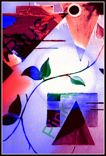
A Kandinsky inspired painting on canvas has provided this colourful print.  I was looking towards using geometric shapes, straight lines and boxes to produce an abstract image.

I then added my trademark leaves which I thought worked well with the overall impression I wanted to achieve.


Lastly I incorporated text to give a modern and diverse dimension to the overall image.